CommScan
Simplifying conversation analysis.
- Client
Bureau Zuidema, on behalf of Brthrs
- RoleDesign lead
- DeliverablesUX design, Design system, App design, Prototype
- PlatformiOS, Android
- Year2023 – 2024
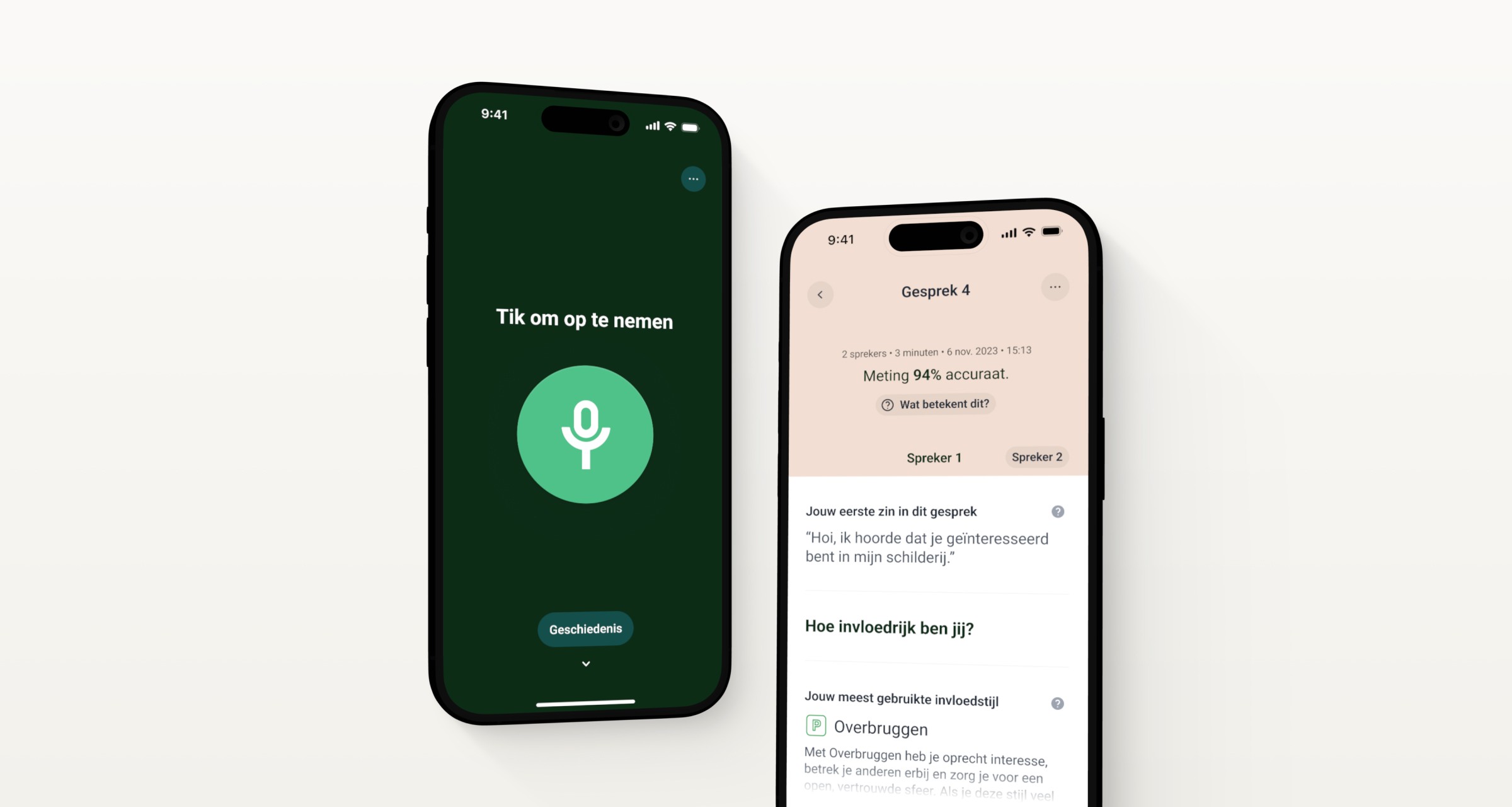
CommScan is a technology developed by Bureau Zuidema for professional teams to analyze communication behavior. In late 2023, I was approached by Brthrs Agency to design the mobile CommScan app for their client, Bureau Zuidema. Within a few weeks, I transformed the initial user flows into a full prototype, including motion design.
Background
Designed as an initial release, the client wanted CommScan to be a simple app with the purpose of recording and analyzing conversations between two people, with the goal of improving communication behaviour by giving the user feedback about influence style, use of diminutives, speaking clarity, interruptions, etc.
Opening the app, recording a conversation and analyzing it.
I adore the quote by Dieter Rams "Good design is as little design as possible". The record design only shows the absolute necessities to the user. The record screen features the elapsed time and a button to stop the recording. While talking, the darker shade within the button reacts to the microphone audio level, becoming larger and smaller to indicate that sound is being detected.
Upon finishing the recording, the app's design shifts to a lighter aesthetic to create contrast between recording a conversation and analyzing it.
Screenshots from the Analyze view.
After recording a conversation, CommScan analyzes it and offers helpful indicators. Each section is accompanied by an explaination, which is presented with a small bottom sheet.
The “Speaker 1” and “Speaker 2” buttons become visible after the user has scrolled, fixing the “Speaker Heading” to the top. Users can use these buttons to quickly scroll to either speaker.
The user can change the name of the conversation, or delete it. The metadata in the top of the view contains the number of speakers, conversation duration, date, and time.
Viewing conversation history.
From the Start screen, the user can navigate to the History screen. The animation provides a smooth transition between the two screens, allowing users to view past conversations on the History page.
Communication with the client went smoothly, and a complete Figma file was delivered with developer specifications. The app was developed and is being used by managers, executives, and other professionals participating in one of Zuidema's training programmes.


