Scheduled
Designing helpful messaging automation.
- Client
- RoleDesign lead
- DeliverablesUX design, Design system, iOS app design, Prototype, Web design
- PlatformiOS
- Year2022 – 2023
Scheduled is an app that allows you to schedule written text messages and send them automatically with services like iMessage, WhatsApp, Telegram, SMS & Email, allowing you stay in touch with people around you at the moments that matter. In late 2022, I was approached by the founder of Scheduled to redesign their then-called “Scheduled Classic” app from the ground up. I took on the project, and over the following months, worked on it part-time alongside my full-time university studies.
Background
Scheduled was first launched in 2017 and has gotten lots of updates since. In 2022, a breakthrough feature was added, making it possible to automatically send messages with various messaging services through Apple’s Shortcuts functionality. However, the app wasn’t initially designed around it. As the Shortcuts integration required a lot of extra setup, many users found it difficult to set up, and as a result, could not use this feature. Overall, there was tons of design debt, and the decision was made to rethink the user experience and interface and, ultimately, design a entirely new app.

Noted pain points after thorough assessment. (Client is Dutch).
Defining the problems
As I was the sole freelance designer working on this project, it was especially important for me to work in a structured way. I used the Double Diamond design process to first understand the issues, and defining the most important principles of the solution. Prior to laying down the first pixel, I conducted an assessment of the existing app, identifying pain points in the user experience using a flow chart.
In particular, the largest pain points were in its onboarding flow, as users need to install an Apple Shortcut for the app to function properly. This process was prone to failure as users had to switch between Scheduled and the Shortcuts app to install the Shortcut. Scheduled couldn’t check whether the installation has been successful or not, resulting in frustrated users when they discovered their Scheduled message couldn’t be sent.


Flowchart of the old onboarding flow, with each point of failure highlighted.
Several critical issues required attention:
Redesign onboarding so that it’s more comprehendible and lets users get going faster
Make onboarding tasks like setting up Shortcuts modular, making it possible to spread out the setup
Define hard-to-grasp concepts like Automations and Shortcuts to the user
Unify and simplify the main app screens with a people-first approach
User flows
With the problems and deliverables defined, I began working on the user flows for the app, keeping technical limitations into account. These limitations are critical due to the tight integration with Apple's Shortcuts. For each use case, I worked out a happy path and alternative flows for situations where users might deviate from that path.
I divided the onboarding into two sections:

User flow for the first "traditional" section of the onboarding.
1. “Traditional” onboarding
This section includes signing up/logging in, phone number verification and requesting permissions.


User flows for setting up the Reminder Shortcut and Automation Shortcut.
2. Shortcut setup wizard
This section includes installing the Shortcuts required for the app to function. The app utilizes these Shortcuts to send scheduled messages, either by tapping them from the Lock Screen using the Reminder Shortcut, or automatically, using the Automation Shortcut.
Since this step takes time to set up, it was important to make it modular and detach it from the onboarding process. This allows users to skip the setup initially and discover the app before installing the Shortcuts.
The new setup wizard also includes a validation process that checks if the Shortcut has been installed correctly, as users frequently hit a wall when the installation wasn't successful.


User flows for Messages, Compose and Settings.
Besides the onboarding, a lot of thought and consideration went into all the other parts of the app to make it as simple as possible. This enabled the design to feature a single view without a tab bar, cutting down cognitive load for the user.

163 of the 242 wireframe screens.
Wireframes
Creating wireframes based on the user flows offered a swift method for generating a low-fidelity design suited for prototyping. This made it easy to communicate the flows to the client during the early stages. Besides, as a nitpicky designer, it helps to focus on the essentials rather than getting caught up in intricate details! (Don't worry, the pretty pixels will follow below).


Color and typographic styles.
Visual design
Now that the user flows and wireframes had been approved, it was time to kick off the visual design phase. In terms of brand design, the client requested that I adhere to the existing branding but expand on it where necessary. Since the previous design system only featured three shades per color, an update to the color styles was much-needed. The typographic styles are based on the iOS text styles to maintain as much consistency with the system as possible.

Some screens from the Onboarding flow.


A glimpse in the iteration process of the setup overview screen.
It should come as no surprise that achieving good design means iterating a lot. Practically every part of the app went through rigorous iterations to refine its visual design.

1. Messages view scrolled to top. 2. Message context menu. 3. Message detail view.
Messages
The main screen of the app, the Messages screen, features a chronological timeline of all the users' scheduled messages. Upon opening the app, the message scheduled for "today" will be displayed at the top. Users can scroll up to view messages scheduled for the future and scroll down to see past messages. Users can manage their messages by accessing the context menu or by tapping on a message to dive into it.
Opening the app and viewing a scheduled message.

Contact screens.
By tapping on the avatar of a contact in the Messages screen, the app shows all the messages scheduled for that contact. This makes it easy for users to view all of the messages scheduled for a single contact. From here, users can also add the contact to a group.

The Message Card component, showing various different combinations.
Due to the potential variability in the parameters of a scheduled message, it was important to ensure that the Message Card component could handle various use cases, while maintaining visual appeal.

Some screens from the Filter flow.
Scheduled has a diverse user base, ranging from casual users to power users with over 100 scheduled messages. An expanded filter view enables users to have that extra level of control, allowing them to filter scheduled messages for contacts, messaging services, scheduled date, repeat options, and status.


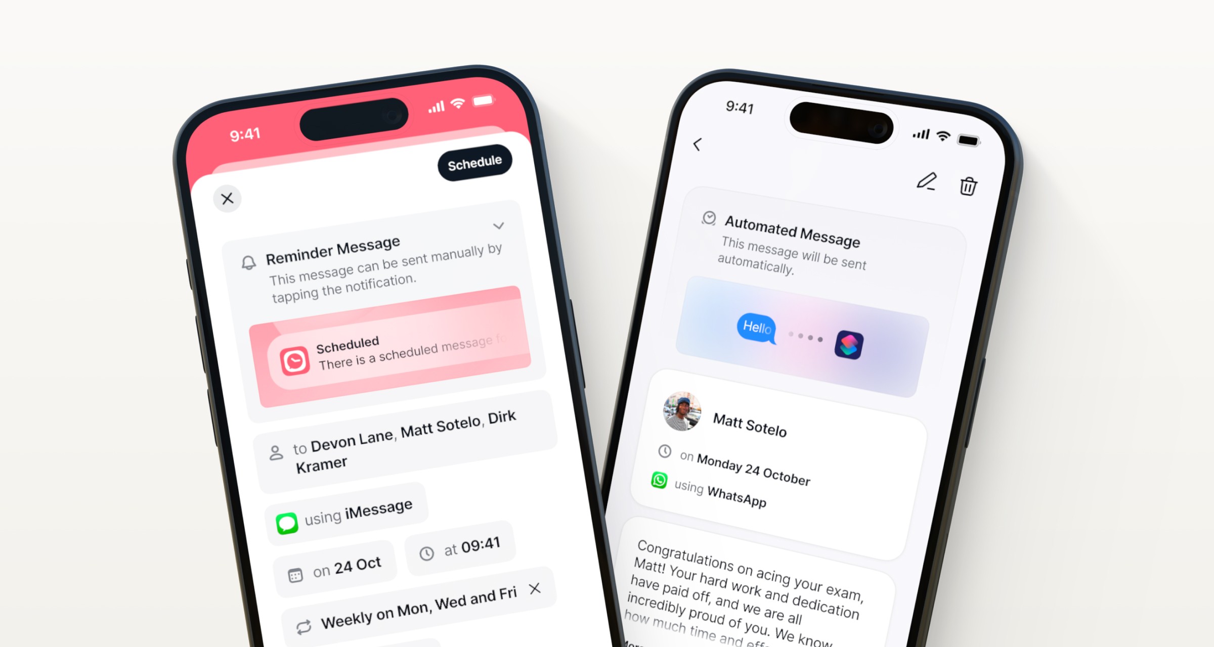
Some screens from the Message Compose flow.
Compose
The redesigned Compose flow design offers a scannable interface that presents the fields in natural language. The difference between a Reminder Message and an Automated Message is communicated clearly.
Key controls, such as selecting messaging services and setting dates and repeat options, are conveniently located at the bottom for easy reachability. More advanced options such as custom repeats, templates, and variables are not in the foreground but remain easily accessible without overwhelming the user.

Some screens from the personal automation setup flow.
Personal automation
Scheduled uses what's called a personal automation to send messages automatically. After installing the Automation Shortcut, the personal automation needs to be set up.
This is a very complex task for most users, as they need to create a new personal automation in Apple's Shortcuts app. In total, the process takes 8 steps. As you can probably imagine, performing this task without a second monitor is very tedious. For some users, the app could even quit in the background while setting up their automation in Shortcuts due to a lack of system memory. This made the process even more frustrating.
To fix this problem, I opted for a guide that presents the steps in easy-to-follow instructions, accompanied by a video. This video can be viewed in Picture in Picture, allowing users to watch the steps while performing them themselves. Users can quickly return to Scheduled with a tap and proceed to the next step.


Screens from the app's Settings, and the group creation flow.
Settings
Scheduled's new Settings section offers easy access to information and preferences. Users can set their preferences, such as adding, removing, or reordering messaging services, and managing groups and templates.

A handful of the 829 components.
Component library
To maintain clarity and organization in the app's design language, I developed an extensive component library in Figma from scratch. This library was based on the fundamentals (colors, typography) established at the beginning of the visual design process. Excluding iconography, the library features 959 styles and components.

The component library in Figma, neatly sorted.
Landing page
Halfway through the visual design for the app, I was approached again for redesigning the landing page for Scheduled Moments, a sister app from the same company. After lots of iteration, the final design was delivered.

The Scheduled Moments landing page.


